boring UX is good actually
counting what visitors did at a touch table in the Stadtmuseum Simeonstift Trier
Peter Ehses-Reifer · october 2026
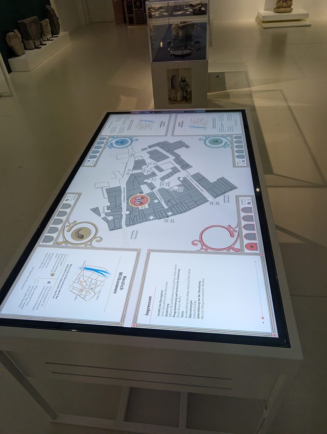
In October 2026 the Stadtmuseum Simeonstift in Trier opened an exhibition on the city's medieval Jewish quarter. In it stands a table that the visual designers Milena Biesel and Daniela Schurig and I built; my part was the UX and the implementation.1 It's a 65-inch touchscreen lying flat in a stand, at about the height of a desk, with a corner for each of up to four people and a reconstructed map of the quarter in the middle. Ten crosses on the map mark places. You pick up your corner's piece, set it down on a cross, and your corner's panel tells you about the place. Five more things are hidden where nothing is drawn.2
This article is about how I tried to find out whether the table works, and what "works" can mean when you can't ask anyone. The brief had two requirements that pull against each other. The interface had to be dense, with a lot of images and text, because the content was the point. And strangers had to be able to use it, several at once, without anybody explaining it. A museum has no onboarding, and a visitor gives an exhibit a few seconds. Twenty years of research on tabletops and public displays say a good deal about the second requirement. I'll go through what that research predicted, what one anonymous line per session showed in the first ten days, and what I changed. The conclusion comes at the end: the research got the shape right, and everything the table lost people on was too small and too local for a paper to have known.
Game pieces
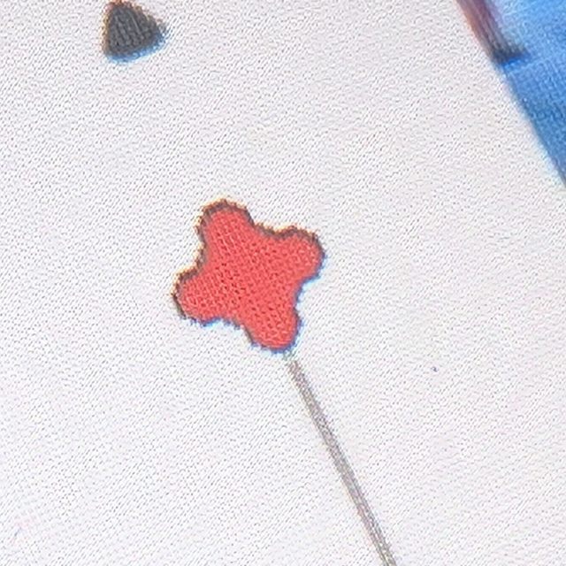
Early on, the design converged on game pieces as stand-ins for the users on the map. A piece does several jobs at once. It's a cursor everyone can see, so you know which part of the map is busy without asking. It gives each corner an owner without a login or a colour choice. And it holds the whole grammar of the interaction: picking it up starts, setting it down on a cross asks about a place, putting it back on its ring stops. In Norman's terms the piece is the signifier for the whole session.3 I assumed nobody needs to be told that a game piece is there to be moved. For about a quarter of visitors that was wrong.
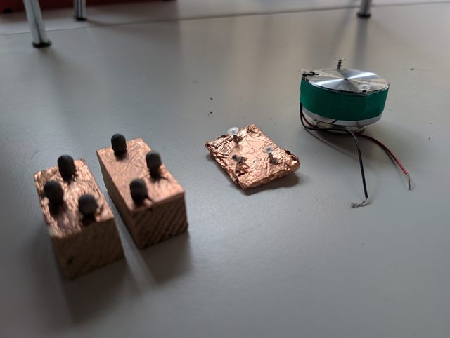
The first pieces were physical. A capacitive touchscreen only notices things that conduct, so I built small wooden blocks wrapped in copper tape, standing on three off-the-shelf stylus nibs. The panel reads them as three fingers in a fixed triangle.4 A block on the glass produced a recognisable pattern. Making it reliable didn't fit into the time there was, and the reasons are properties of the medium. The panel tracks at most twenty touches at once, and four pieces standing on it would have held twelve of them for good. The panel sees a piece only while a hand is on it, because the hand closes the circuit; a piece set down and released vanishes. And at this panel's accuracy there are only three to five triangles it can tell apart, for four pieces. Tangible pieces on tables usually sit on surfaces that can see them by themselves; a capacitive panel can't. So the pieces became software, drawn on a ring in each corner, and you grab them off the glass.
What the literature predicted
Touch interfaces feel like a solved problem. Phones taught everyone to tap, swipe and pinch, and the conventions are good. But a screen the size of a desk, lying flat, used by four strangers at once, is a different device, and most of what makes a phone easy doesn't transfer. People have studied tables like this since the early 2000s, first in the lab and then in the wild, and the frictions have names.5 Before building, I went through that work and gave each friction a decision: mitigate it, design it into the experience, or accept it and measure what it costs. The three-way sorting is mine. I haven't found it under another name yet and expect that it exists.6
A table has no top edge, so two of the corners are turned round and both long sides are equally good.7 The far side is 143 cm away and nobody can reach it, so every corner is a complete game on its own and the far side is never needed.8 Strangers need to know whose part of the surface is whose, so each piece belongs to its corner by colour and by a symbol.9 Joining people who are already using a screen is awkward, and people watch before they touch,10 so an empty corner, with its piece waiting on the ring, was meant to be the invitation. People lean on tables, and the panel quietly discards any touch it takes for a palm, so nothing depends on timing and nothing needs two fingers. And visits are short and nobody reads instructions,11 so the first drag was meant to be the instructions, and each place gets one strip of text instead of a menu. All of this was decided at a desk, from papers, before anyone had stood at the table.
One friction the papers don't mention, because it belongs to browsers: four people scrolling four panels at the same time is something a browser won't do. It sends all scrolling to one place at a time, and while one finger scrolls it ignores every other touch on the page.12 So the table reads every finger itself and does its own scrolling.
Seventy pixels per inch
It's a 4K screen. It's also 65 inches across, which leaves it with about 68 pixels per inch. That's roughly the resolution of the print on a truck's tarp, which is meant to be read from across the street. Here, people look at it from half a metre away.13 Each pixel is about 0.37 mm wide, and you can see them.
That changes a few habits. Hairlines and fine ornaments break up into steps. Text has to be big, which it had to be anyway for reading while standing. And a size in pixels stops meaning anything, so everything on the table is specified in millimetres and converted, at 2.7 pixels per millimetre.14 The designers drew their frames and icons for this screen, and they're placed pixel for pixel, because smoothing them out lost the hand-drawn look.
Then Windows had its own opinion. It treats big touchscreens as something to read from a distance and scales them up by default, so the browser reported our 3840 × 2160 screen as 1280 × 720. Three bugs showed up at once: the layout came out three times too big, the pieces hid behind the panels, and scrolling several panels at the same time stopped working altogether. Since then, the whole surface is drawn at full size and scaled as one picture, and nothing in the code asks the browser how big the window is. The design lands on the screen as it was drawn.
One line per session
Every time someone plays, the table writes one line: which corner, which places the piece rested at and in what order, which texts were opened and how far they were scrolled, and how the session ended. There's no camera, no identifier, and no clock finer than the hour. A line can't be matched to a person, not even by someone holding the museum's own camera recording for the same hour.15 Before the museum opened I wrote down what I'd look for and what would count as a result, so I couldn't talk myself into things afterwards.16 I had planned to compare two onboarding variants, rotated in half-day blocks, and dropped that before opening. What's left is a description of what happened.
A line can support some claims and not others. The lines say what people did. They don't say what people understood; for that someone has to ask them. There is a three-question sheet for the invigilators to use on the way out, and any claim about comprehension has to come from it, not from the lines. In particular, the time a text is open is not a measure of understanding: a strip stays open while a visitor looks at the map, talks to a companion, or walks away. And a "person" below is a session at one corner. A family sharing a corner is one session; someone who moves on to the next corner is two, and nothing links them.17
What the first ten days showed
Here is what the first version's first ten days looked like. There was no randomised comparison, so everything in this section is an observation, not an effect.
For every four people who picked up the piece, one put it straight back down where it was, like pressing a button, and that was the whole session.18 The piece, the one thing I had taken to be self-explanatory, read to a quarter of visitors as something you press. There's a reason. A round, coloured disc with a symbol on it looks like every button they've ever seen on a screen, and the ring around it reads as the button's border.
What the lines didn't show at all were the people who tapped the crosses on the map, saw nothing happen, and walked away. They never touched a piece, so for the table they never started a session, and the session was the unit of record. I noticed them at the opening night, standing behind the table. Only after that did bare taps on the map go into the log.19 A count can only count what you thought to count, and the people an interface loses before it notices them are exactly the ones a log is blind to. I have no answer to this beyond standing in the room, and that doesn't scale. The exhibition studies that found out most about visitors did it by following them with a stopwatch.
Of the people who were alone at the table, about one in three never got their piece onto the map. With somebody else playing at another corner, it was about one in seven.20 Brignull and Rogers called this the honeypot effect: people learn a public screen by watching others use it, and a used display draws a crowd that then uses it.21 The design relied on it; the empty corner was supposed to invite. But a honeypot needs someone to watch, and a visitor alone at an empty table has nobody.
For every three texts people opened, two were never scrolled. But of the texts that were scrolled, four in five were read at least halfway and three in five to the end. I had predicted, in writing, that fewer than a quarter of the sessions that opened a text would finish one, and had set a bound below which I'd call the texts too long.22 The texts weren't too long. The people who scrolled read them. The texts just didn't look as if they went on past the edge of the panel.
About three in ten sessions ended with the table asking "still there?" and nobody answering, and nine in ten of those had a text open. Some of those people had left. Some, I suspected, were still reading. The idle timer counted from the last touch, so a slow reader looked like an empty corner.
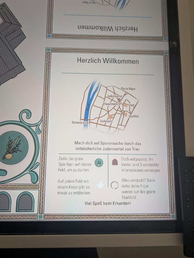
And for every six people who got their piece onto the map, one found a hidden thing. One in forty found all five. Whether that's too few is a matter of taste; the hidden things were a game on top of the exhibit. I treated it as a finding anyway, because the ring around the piece was the only hint and nobody read it.
One change per finding
Each finding got a change, and each change sits behind its own switch, so it can be taken back on its own if the next weeks say it was wrong. The map, the texts and the frames stayed as they were; they're the designers' and the museum's. Everything below is in the layer between a finger and the content.
The table answers a tap now. Tap the map or press a piece, and all four pieces at their rings lift a little: the table noticed, and these are the things that move. Tap again, and the cross you tapped takes the colour of the nearest free piece, which slides toward it and back: not that, this. A few taps in a row count as one question. Drumming on the table gets no answer.
An empty corner shows one rule, large, instead of all four. When the whole table is empty, the corners take turns going through the rules, and at "drag the piece" the piece makes the move by itself. That's the honeypot without the crowd. As soon as anyone plays anywhere, it stops, because now there's a real person to watch, and motion in the empty corners would compete with them.
The little hand that says "this goes on" now appears on every text, in short bursts, until that text has been dragged; it used to appear once per visit. And the first swipe pulls the strip along a little, so you can see that it moves.
"Still there?" now waits a minute after the last scroll, instead of 45 seconds after the last touch. The table also records the longest pause between two scrolls on each text, so the next value for that timer comes from what readers do.
And the hidden things show themselves a little: their symbol appears as soon as a piece comes within about ten centimetres, and the texts of places with something hidden nearby say so in one line.
Why boring
The papers got the big things right: the corners, the orientation, the territory, the empty corner as an invitation. None of the five things the table lost people on was at that scale. A piece reads as a button. A strip doesn't look as if it goes on. A timer counts the wrong thing. These are conventions of this one table, read by this room's visitors, and I don't think more reading would have found them, because the table didn't exist until it stood there. The literature can say what kind of thing will go wrong. It can't say which drawing of a piece will read as a button to a quarter of the people who come through Trier on a Saturday. The people found that, and the table wrote down what they did.
That's the part I wanted to show, and it's the boring part. Writing down beforehand what you'll look for. One line per session. Counting, dividing, and waiting until there are enough lines to say anything at all. No workshop, no personas, nothing that looks good on a slide. It's still what found all five problems, and it's what will tell us whether the fixes did anything.
Two limits. The comparison between visitors alone and visitors in company is confounded by session length and by everything else that differs between a quiet morning and a busy afternoon, so the honeypot is the likely reading and not the proven one. And the measure of success I have is behavioural: whether more people get the piece onto the map, whether more texts get scrolled. Whether anybody learns anything about the medieval quarter is a question the lines can't answer.
The second version's lines are coming in now. I'll add how it did when there's enough to say something. The table is also the site of a study on very large touchscreens, which will get its own write-up.
Inside it: a 65-inch touch panel, a small PC and a browser. No app store, no cloud. In the Stadtmuseum Simeonstift Trier since October 2026.